
Redesigning Online Learning: More than meets the eyeAt the time of writing this I work for a Pension Fund that offers services to the Episcopal Church. My team is currently involved in a multi-year corporate project to refresh our public facing website. Last year the company released a newly defined online learning strategy, which required us to take a comprehensive look at how we presented learning on our company website. The company offers a variety of learning courses, informative articles, tools, and videos with the intention helping those we serve make the most out of the various products and services we offer them. My teams task was to provide the user with an experience that allows them to quickly and easily find what they need.
We were tasked with reorganizing the site to shift away from a role-based structure into a more goal-oriented or journey-based structure. The goal was to deliver our content based in a more natural way, focusing on what the user was trying to do, and at what stage in their life they are at.
the problemThe existing online learning experience was bucketing the user into categories based on their role and relationship with the church. Meaning we were presenting information that required people to fit into a specific niche, and discouraged exploration outside of how we were limiting them.
the SolutionThe Education Strategy team wanted to shift how we refer to categorized learning towards a more natural experience, that also encouraged users to explore and continue learning.
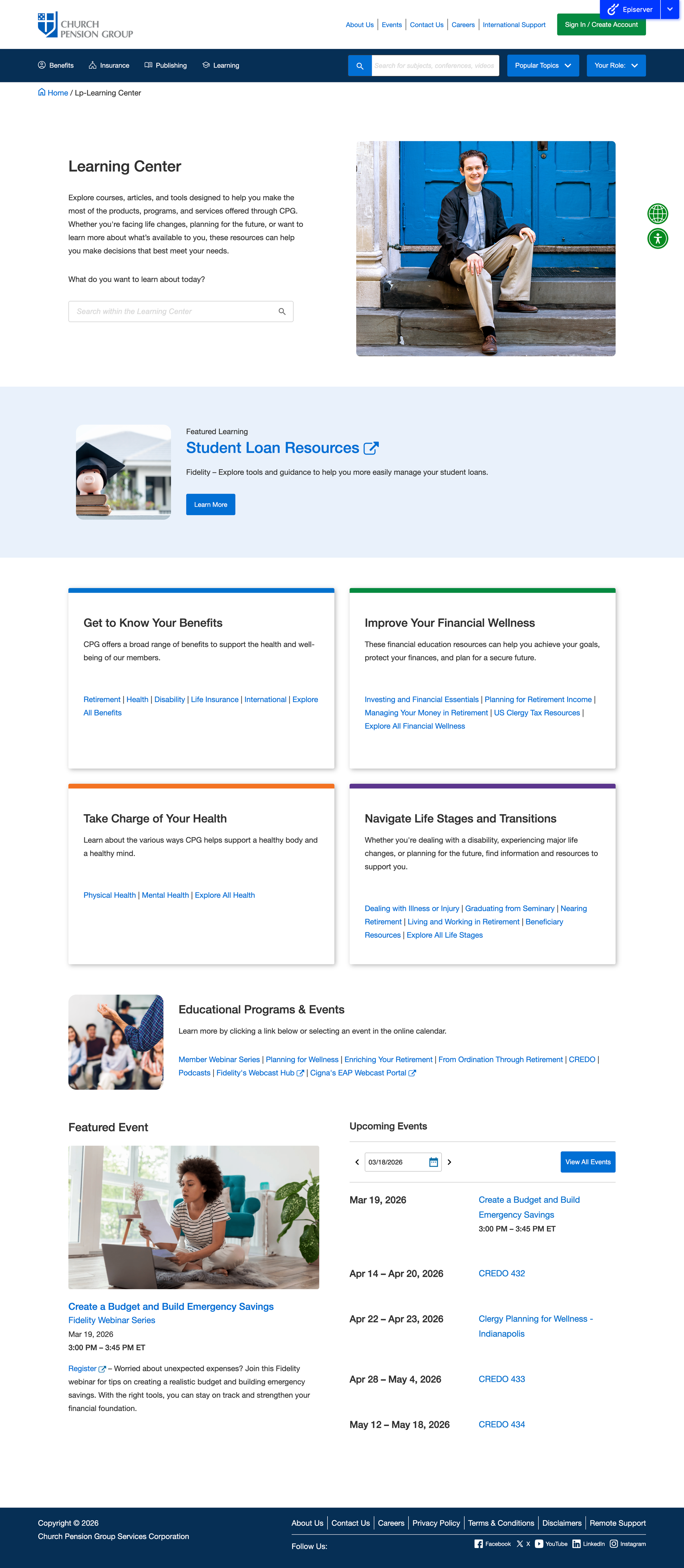
Through a collaborative exploration with education, content, and my team, UX, we compiled client feedback and comparative research to decide on the following five categories - ‘Get to Know Your Benefits’, ‘Improve Your Financial Wellness’, ‘Take Charge of Your Health’, ‘Navigate Life Stages and Transitions’, and ‘Education Programs and Events’.
We knew that this re-categorization was only half the battle. The other half would be restructuring the Learning portion of our website to allow for users to navigate through these new categories, quickly find what they are looking for, and encouraging them to engage with content that might have been previously overlooked or missed.
my roleUX Designer, User Interface Designer – Supporting Role as Solutions Architect
goals & ConstraintsGoals
Improve find-ability and discoverability.
Allow for easy searching.
Encourage engagement with new content.
Architect a structure that allows for tiered categorization without burdening the CMS.
Constraints
The primary limitation was in architecting a structure that uses new categorization language not familiar to our users while also improving the speed to which users can find things.
Our site search did not allow for searching within specific sections of the site. We wanted to develop a system that allowed for sectional search. This would require us to take a look at how content and assets are structured in the CMS, and how we could rework that to allow for this functionality.
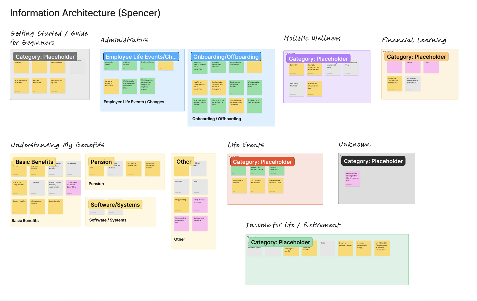
my processStep 1: Content Audit and Re-Catergorization
UX partnered with Education Strategy and Content teams to audit existing learning assets. Previously, content had been organized by assumed audience segments, which led to overlap and duplication. To address this, we:
Broke down all assets into individual items
Identified redundancies and gaps
Re-evaluated how content should be grouped
Using FigJam, each asset was mapped to a sticky note and independently re-categorized by team members. We then compared approaches, identified patterns, and aligned on a more intuitive, user-centered categorization framework.
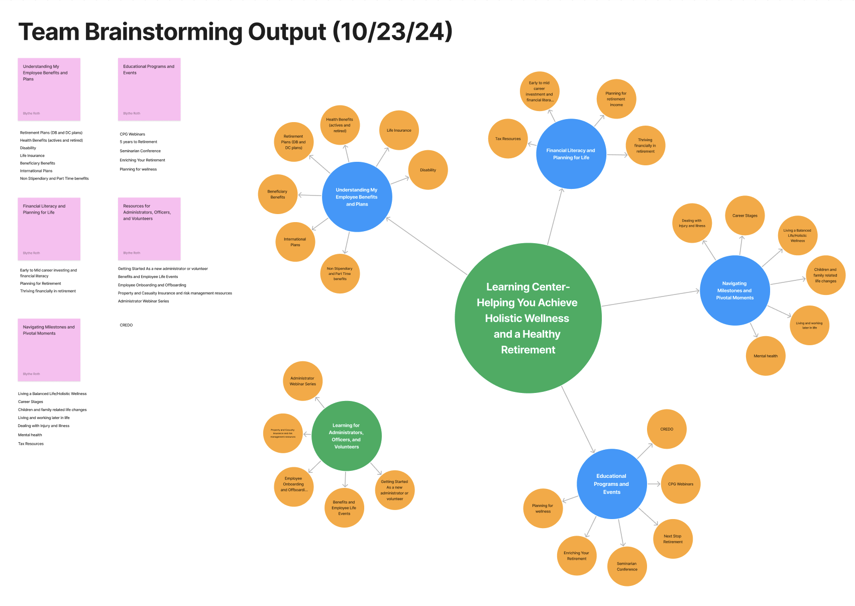
Step 2: Information Architecture and Interaction Design Workshops
With updated categories established, we facilitated whiteboarding sessions to define the overall information architecture and navigation model. Given the mix of internal and external learning content, we explored:
How users would browse, filter, and discover content
How different content types should be structured and surfaced
What navigation patterns would best support exploration
These sessions also informed early thinking around the interaction model, helping identify the need for new page templates and reusable UI components.
Step 3: Research, Wireframing, and Iteration
With a clearer content structure in place, I conducted competitive and comparative research to understand best practices for organizing and presenting learning libraries.
I analyzed platforms such as Fidelity, Vanguard, and E*TRADE—focusing on how they balance:
Educational content with product offerings
Content discovery vs. guided learning
Internal vs. external resources
This research helped inform how our own experience should support our core goal: enabling clients to better understand and use retirement and health products, while also integrating relevant third-party educational content.
Using these insights, I began sketching and wireframing early concepts, iterating on layout, hierarchy, and content presentation.
Step 4: Interaction Model Refinement and Component Design
Building on earlier categorization work, we defined a system of primary categories and subcategories that supported both:
Quick filtering for targeted searches
Open-ended exploration and discovery
The interaction model needed to accommodate both behaviors. While an existing basic filtering system provided a starting point, it required significant enhancement to support this more flexible structure.
In Figma, I progressed from low-fidelity wireframes to high-fidelity prototypes, refining:
Filtering and sorting interactions
Navigation patterns
Reusable UI components
These prototypes were used to align stakeholders and gather feedback throughout the design process.
In parallel, we identified that the front-end experience depended heavily on how content was structured and tagged within the CMS. This led to a deeper evaluation of our content model, with the goal of creating a system that could partially automate categorization and reduce manual effort for content managers—covered in the next step.
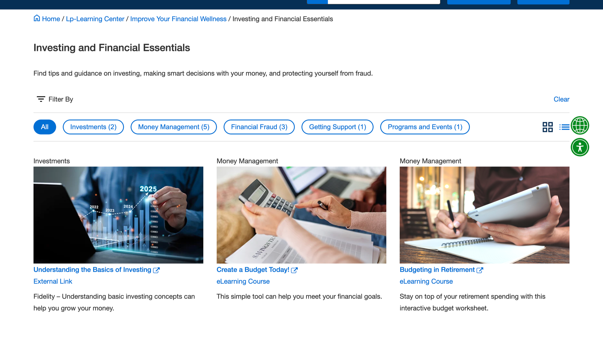
Our new two-tiered filtering system in action.
Step 5: CMS Architecture, Tagging Model, and Content IA
In addition to UX/UI design, I worked closely with Content Managers and the Technical Solutions team to refine the underlying CMS architecture that powers the experience.
Our goal was to reduce manual effort and create a more scalable system for managing and surfacing content. This required rethinking how different asset types—internal pages, PDFs, and external links—were structured and handled within the CMS. We:
Audited existing content models and workflows
Standardized how different asset types are created and managed
Designed a flexible tagging and categorization system aligned to the new IA
Enabled content managers to create, link, and reuse assets more efficiently
The result was a backend structure that supports automated or semi-automated content population, while ensuring content is consistently organized, easily filterable, and clearly presented in the front-end experience.
Step 6: Development, QA, and UAT
Working within a lean team, I partnered closely with Engineering and QA to bring the new experience to life. To ensure a smooth handoff, I:
Authored detailed functional and technical requirements
Defined interaction behaviors, edge cases, and acceptance criteria
Collaborated directly with developers to clarify implementation details
I also worked closely with the Technical Solutions team to align on best practices for CMS implementation. Because QA had limited prior experience with the CMS (previous work had been handled by an external agency), I supported onboarding by:
Walking through CMS workflows and content structures
Clarifying expected system behaviors and edge cases
Partnering directly in QA testing to validate requirements
This close collaboration helped ensure the final product aligned with both the intended user experience and the underlying system logic.
reflectionI very much so enjoyed how much I was involved in the end to end development process of this project. This project gave me the opportunity to not only refine my core UX/UI work, but also dive into other portions of the development process. In this next stage of the project I am currently involved in at the time of writing this I am being trusted to lead the requirement writing process and also the relationship with technical solutions and developers.
Future Improvements
In this next stage of the project we are working through adding personalization to the site, so we are having to take another look at how we can better improve the scalability of our CMS tagging and categorization process. We are actively figuring out how both personalization and user segmentation could add a more intuitive and helpful layer to our learning center as well as other portions of the site.